Analysis of The Big Issue
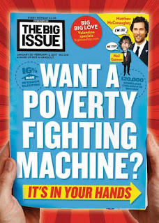
The masthead is located in the top left corner where it usually is on the cover of The Big Issue. The masthead stands out due to the concrete colours of black and white. The colours also stand out on the light blue background.
The sell lines underneath the masthead say, 'A hand u not a hand out', which is what is usually written on the cover to attracts readers to think more about why The Big Issue is being sold.
Also on the cover there is no main image, just the rhetorical question, 'Want a poverty fighting machine?' which again shows the reader why they are buying the magazine.
The colours are all prime colours, red, blue and yellow, and reflects the 'hero' message they are trying to establish by making the reader think they are in fact a hero for buying the copy. The font of the writing also suggests a 'super hero' outlook on buying the magazine.
In the top left hand corner there is an advertisement to show that celebrities are also involved in the big issue.
First looking at this cover I can see that the masthead is in the usual top left it is regularly seen in as well s the same sell line as before. However, the date and price is not above the masthead as it usually is and is in the top right hand corner instead.
It is clear that the reader will most likely look at the 'Dunkirk Spirit' first, then the main visual image and then the masthead. The colours of blue and yellow complement each other and the font again shows a type of super hero quality.


Comments
Post a Comment