Analysis of magazine covers
The Big Issue


The main visual image of this cover is the main focus wanted due to the bright colours used. The colours are there to attract the audience to the magazine. The contrast from pink and blue makes Gallagher stand out on the front cover. Also the name 'Liam' is in bold, capital letters to make the celebrity stand out.
The mast head is in the top left corner where it usually is for The Big Issue. Gallagher is pulling a very serious face which I believe contrasts from the happy vibrant colours he is wearing and in the background.
The magazine advertises an interview with Gallagher on the cover, as well as a quote from the interview to intrigue the audience.
Also on the cover, the editors have put an entry on the front to involve the audience directly as the entry is 'free'.
The main image is in the center to draw more attention to the artist.
The sell line on the bottom of the front cover engages the reader as Gallagher said it. It also intrigues the reader to fine out why it was always about Gallagher anyway.
The main image is in the center to draw more attention to the artist.
The sell line on the bottom of the front cover engages the reader as Gallagher said it. It also intrigues the reader to fine out why it was always about Gallagher anyway.

Morrissey is the main visual image of this issue of The Big Issue. The picture is in black and white to give an authentic feels to the singer when he was younger. The bright orange background grabs my attention as it is bold and vivid to look at. Around the image there are names and lyrics from the song he sang in the band, The Smiths.
The font used is abstract and different to represent that the singers genre of music is indie. It also shows how he and the band are different to society as there songs featured unusual titles such as, The Boy With The Thorn In His Side, Some Girls Are Bigger Than Others and There Is A Light That Never Goes Out as well as an album called Meat Is Murder.
The mast head is in the typical top right hand corner that it usually is on The Big Issue. Morrissey is described on the cover as a 'cantankerous British icon' to bring attention to the viewers and have them interested. This could also be a sell line for the buyers. The buyers are interested by the exaggerated song lyrics on the cover as Morrissey is a very famous Brit that is recognised by he majority of people in Britain.
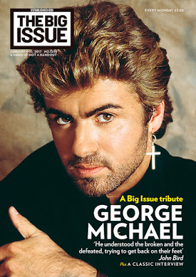
George Michael feature in the center of this issue as have both of the other famous icons. This is to draw attention to the magazine.
The masthead is in the usually place to provide a familiarity to the viewers and readers of the magazine.
A quote is featured in the by-line of the magazine, 'He understood the broken and the defeated, trying to get back on their feet' by John Bird. This would appeal to the views by accessing their empathy and sympathising. The cover is sure to attract people through emotions. These sell lines show the buyer a deeper side the George Michaels death as it is a tribute to him after he died on Christmas day.

Comments
Post a Comment